

Through the last 10 months, You’ve been with us through it all – restoring antique fixtures, selecting and laying new tile, hunting down original wallpaper, and dealing with setbacks like the copper pipe theft in Ep. 2. We’re so excited to finally show you what all of the hard work has culminated in: the restoration of this 1920s Tudor Revival home in Minneapolis, The Wellesley.
We didn’t just highlight the OG charm and character of this incredible home, we also added 1500 square feet, a brand new garage, and new windows. Every design and construction decision was painstakingly made to balance modern amenities and aesthetics with historic accuracy so the new parts of the house blend seamlessly with the impeccable old bones. We saw such potential in the home when we took on this project and we’re thrilled to finally unveil it below:
A To-Die-For Kitchen + Tea Room
The original kitchen was a little tight and in need of some major updating. This makes up a major part of the new addition on the first floor. We couldn’t salvage the cabinetry like we initially intended, so we had custom cabinetry made, attempting to closely match the original trim in the house. It was difficult due to budget constraints, but we managed to fit the bill with beautiful wood cabinets.
For the countertop and backsplash, we went with marble with warmer tones – the brown and grey veining in the countertop is especially suited to the house’s new color palette. We took the tile all the way up to the ceiling for an elegant finish and to add height to the space. The eye just keeps following the marble up!
Our favorite details here: venetian plaster on the range hood added timeless texture, and the ornate sconces over the sink marry history with present trends. In a Tudor home like this one, chrome or brass would have been the standard for metallic finishes, and Lidia loves brass.
The original kitchen was reimagined into a tea room – a transitional space between the new kitchen and dining room that offers a quiet spot for morning coffee with the paper.
All of this design work (and rework) was made possible through series sponsor, Materio, to whom we’d like to extend a heartfelt thank-you for sponsoring this restoration journey. Materio provides an all-in-one workspace that streamlines materials, decisions, and communications. Their thoughtful tools helped us restore this historic home with confidence, precision, and style – making our process smoother and our result all the more stunning. Use code MOONSTONE for 30% off your first month with Materio.
A Multi-tasking Mudroom
Also part of the addition, the new mudroom is a flexible space – part entryway, part office, but 100% chic. The french doors lead in from the new garage off the back alley. Classic 20th-century hex tile was installed in the typical floral fashion (with a soft infusion of color) to create the perfect waterproof surface for slick, snow-covered boots in brutal Minnesota winters.
Custom built-in cabinets offer storage for backpacks, coats, extra shoes and more. The dual desks are the perfect spot to catch up on emails, take a casual Zoom call, or watch kiddos do homework from the kitchen.
The large transom window above the desk area is from our partners and series sponsors, Pella, who helped us select windows that would add modern efficiency but stay true to the home’s original design. Pella’s windows and doors are beautifully built to last, and with almost a century of craftsmanship behind them, they made excellent collaborators in restoring this historic home.
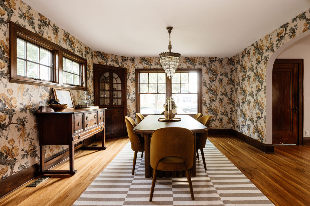
The Dining Room, Reimagined
The dining room turned out to be one of our favorite spaces in the home. You saw us start imagining the design early on in episode one and seeing it come to life is truly magical.
A “wedding cake” crystal chandelier from the same era as the home was re-wired and restored to its full glory. Thanks to Divine Savages in the UK, we were able to find an exact match to the wallpaper that was already in the dining room. We switched things up just a little and picked a gorgeous yellow/blue colorway that ties in tones from the rest of the house – which we loved so much we decided to paper the entire dining room and not just a singular wall!
We can’t move on from the dining room without acknowledging the gorgeous built-ins that the home came with. We’re lucky none of the previous owners decided to paint over them as you often see in historic homes. That would have been so laborious and time consuming to remove (but we would have done it to get to these beauties anyway). Instead, the unadulterated, original wood finish really sings in this room against the contrast of the wall paper.
We also opened up the wall to match the arch on the other side, another calling card of the Tudor revival era that we made sure to echo in our reimagining of the Wellesley.
Living Room + Entryway Updates
Incorporating thoughtful details to the living room made a huge impact on the space. Not a ton of exciting structural updates had to be made in here, so we really got to dig into design. We sourced the medallion-style chandelier from Architectural Antiques as well as the swoon-worthy sconces on either side of the fireplace.
The fireplace got a facelift, too – we left the original floor tile, but the painted brick had to be covered. We used “perfectly imperfect” (as Lidia says) warehouse tile from Mercury Mosaics in a few different earthy colors, and the “new” fireplace stuns from the moment you walk in the front door.
Speaking of the front door, when we started this project, marmoleum covered the original wood flooring by the entryway. We opted for a more permanent weather-proof solution with more tile from Mercury in blue-green tones and a pattern that was in style in the home’s heyday.
We also replaced the front door with a custom fit from our friends at Pella, which let us keep the arch and the stone trim around the frame.
A Proper Primary Suite
Moving up to the second story of the addition, the all-new primary suite is one of the stars of the home. This room is bigger than you’d usually find in houses from this time period, and large windows let in lots of natural light while still maintaining privacy. It’s deliciously bright and airy, and did we mention? Two generously-sized closets – his-and-hers walk-ins.
In the connected bathroom, also new to the home, we combined modern and antique elements for a timeless feel. We restored a cast-iron soaking tub with a good sanding, a few coats of paint, and all-new chrome hardware with a classic telephone design. We went really neutral here so the homeowner’s decoration choices can shine. Marble tile, black and white geometric tiles, and a quartz bench complete the bathroom and walk-in shower.
Niches were installed in the addition to tie it into the original home – arched shelving like this was popular in the 1920s and the new owners can fill them with decor and photos. We also picked up a simple but ornate vintage light for the hallway to pull the space together.
Blue Bathroom
The main goal with this room was to keep the original tile because it could last decades (or centuries) longer. We brought the room into the 21st century with a new chrome and marble vanity, new floor tile (the old floor was cracking and unsalvageable), matching blue cove base, and fun wallpaper. It really looks like an entire new room and the blue tile is right at home – proof you don’t have to completely gut the room to elevate a space.
Upstairs Bedrooms
The 3 OG second-story bedrooms were in pretty good shape already. We added new windows, a closet in one of the bedrooms, along with a fresh coat of paint in each. The biggest project we took on for the bedrooms was refinishing the original solid-wood doors and hardware, including the tricky crystal knobs. Every door was stripped and sanded, stained, sealed, and refitted with the polished hardware. Meticulous projects like these often make a huge difference in bringing back some of the home’s original charm.
Finishing the Basement
The basement was mainly an unfinished storage space before we got ahold of it. Now, it’s a stylish entertaining space with a gorgeous built-in wet bar. We echoed the home’s hexagonal tile theme in a fun blue stretching 2 feet out from the bar, and again in the funky backsplash with an organic edge. The space formerly known as the utility room was turned into a bright, kid-friendly playroom.
When we added on to the house, we also opted to bump out the basement. This allowed us to add a full bathroom, a family room, and an additional bedroom or flex space like a home gym or office. In the new bathroom, the floor tile follows the hex pattern in a playful oversize scale. The glass arched shower door mimics arches around the home, perfect for a guest suite.
The Reveal Party
There were 200 people at our open house reveal party – our biggest yet! The first 40 to arrive got limited edition Moonstone swag bags that were so much fun to put together.
We met lots of cool people, which is part of the reason we love hosting open houses to show off the space IRL and make new connections. It’s the best feeling to look around and see life in the space you’ve imagined! We loved watching conversation unfold in spaces around the home and getting to view the initial reactions to the renovation.
Many, many thanks to our sponsors for making the renovation and reveal party possible – Materio, Pella, Mercury Mosaics, Third Space, and Lane Floral were wonderful to partner with and it was a pleasure to create together. Thanks also to Garty Goodies, who supplied the cute custom cookies for the party!
There’s More Where This Came From
If you haven’t already, subscribe to our YouTube Channel and follow us on Instagram – where you can see all the projects we’re juggling. If you liked following along for this renovation, check out our newest series, Casa Luna, where we remodel the home of Moonstone’s own, Lidia. Thank you for following along!


see comments
close comments