Transforming a 1925 Primary Bath in Edina, Minnesota
We’re so excited to share one of our most recent bathroom remodels. A transformation of a primary bath in the heart of Edina blocks away from 50th & France. Our clients, Lizzie and Drew, were starting a new chapter in their lives by purchasing their second home. Eager to make it their own, they embarked on their bathroom remodel. They aimed to create a space that served their practical needs and reflected their unique personalities. We worked closely with them to create the perfect mood board of selections + layout.
Whether you are looking for inspiration or want to remodel your bathroom, join us as we dive into all the details of this remodel!
Design
Exploring Layout Options: Drafting the Perfect Bathroom Design
During our consultation, it was evident that while the structural integrity of the bathroom was intact, the layout needed improvements. The existing layout had two dividing walls between the vanity and shower area, creating an awkward flow in the space. Rearranging the space was necessary. However, we encountered difficulty due to the slanted ceilings along the exterior wall.
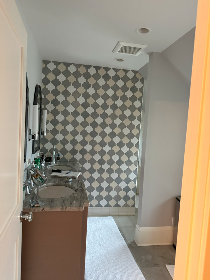
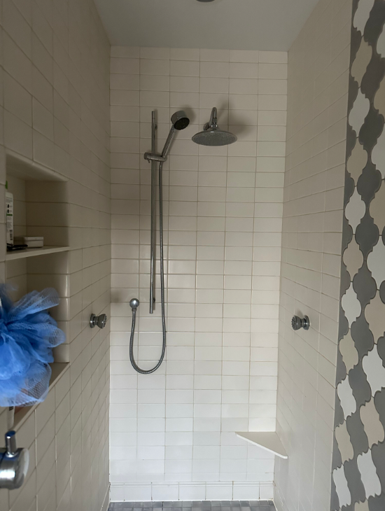
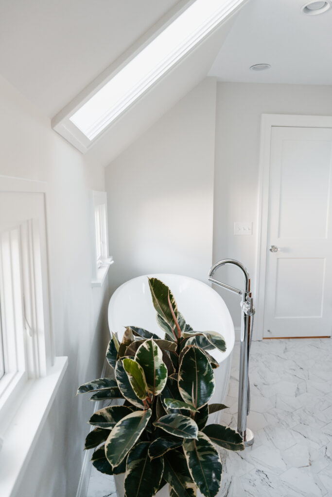
Despite these obstacles, we wanted to create the dream bathroom for our clients. They wanted to incorporate a soaking tub and a skylight to infuse the space with Zen vibes and natural light. After thoroughly exploring several layouts, we finalized a layout that optimized every inch of available space and aligned with our client’s vision!
Fresh Layout Featuring an Added Soaking Tub & Skylight
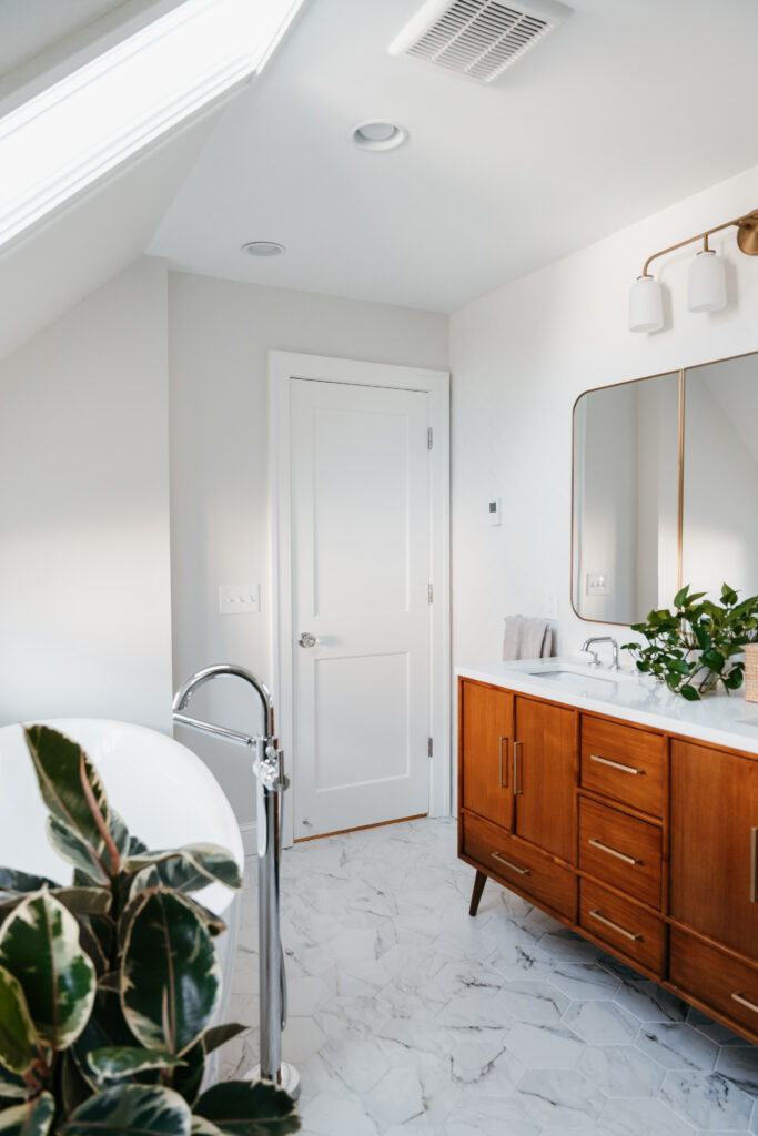
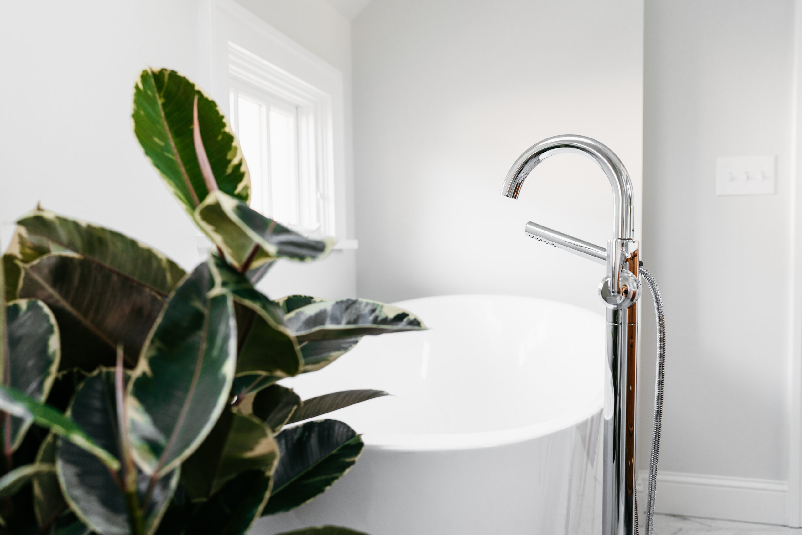
We integrated a soaking tub while maintaining the existing vanity size by strategically relocating the toilet and utilizing the previously awkward hallway space. This allowed for significant improvements without the need for compromises. It also ensured that every aspect of the new design contributed to an elevated experience.
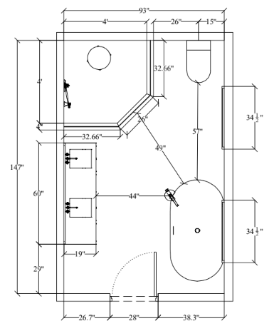
One standout feature of the renovation was the addition of a skylight. The skylight flooded the bathroom with abundant natural light and completely changed the feel of the space. It all came together, making it feel like a serene retreat for relaxation!
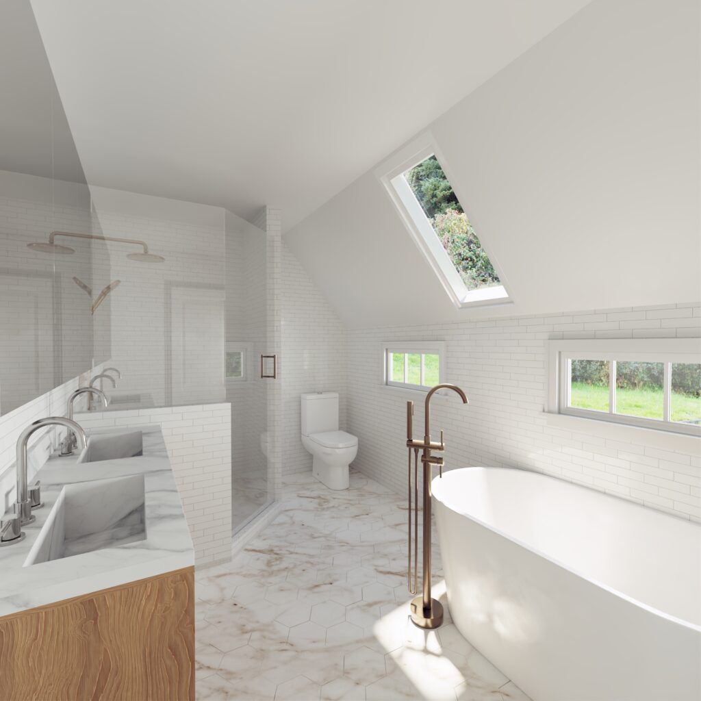
At Moonstone, we’re passionate about crafting high quality renders for our clients, giving them a clear visualization of their selections. This hands-on approach helps many clients feel more assured in their decisions. They can see exactly how their space will come together, rather than relying solely on their imagination.
Selections: Mixing Metals
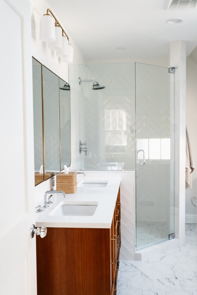
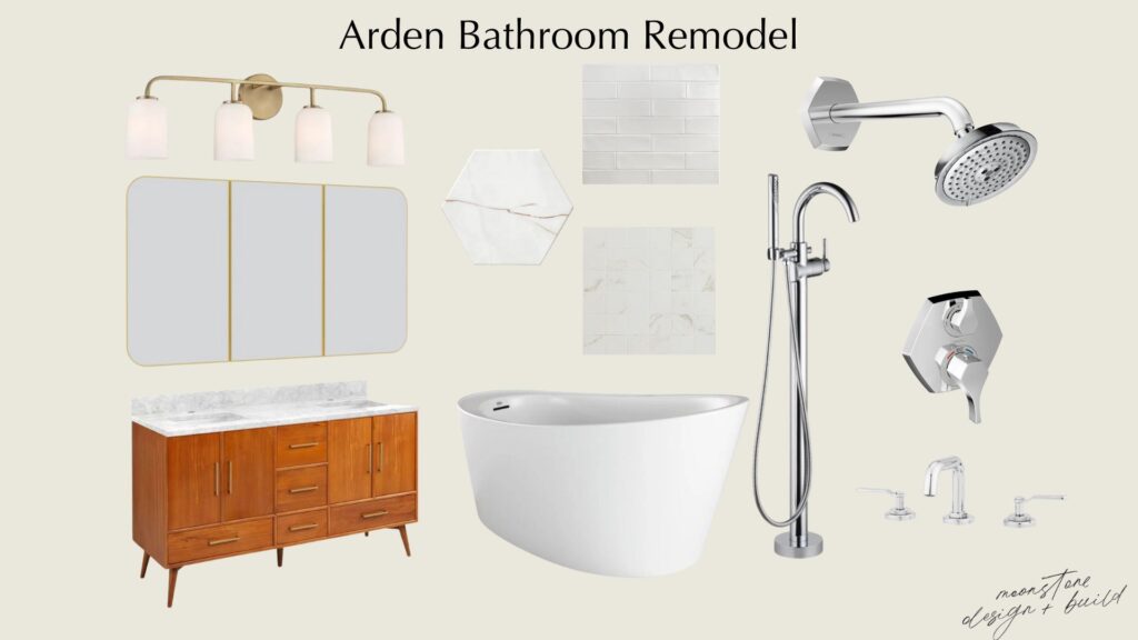
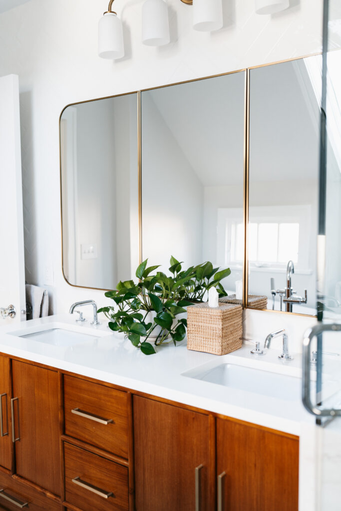
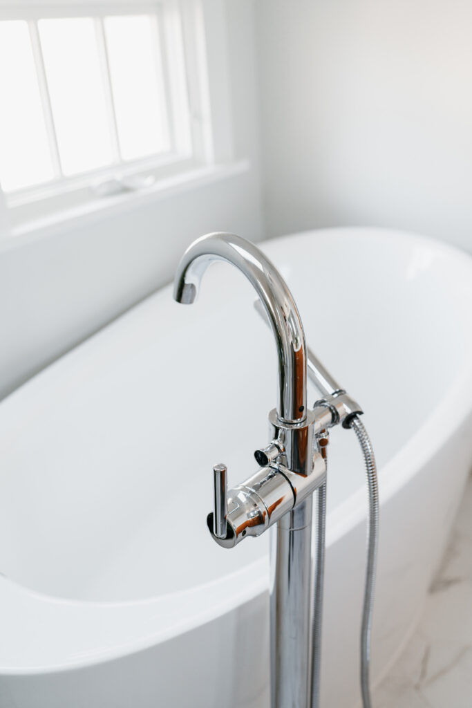
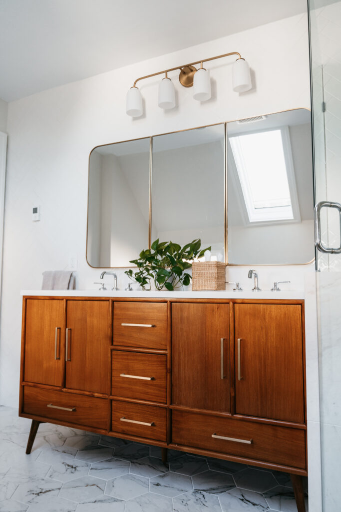
Our clients were torn between choosing chrome or brass for their bathroom fixtures. We suggested that they didn’t have to stick to just one metal. Mixing metals adds depth and visual interest to the space, creating a personalized look. It can create a sophisticated look that elevates the overall design scheme. After exploring different options, they selected chrome as their primary metal but incorporated touches of brass along the vanity wall.
Tips for mixing metals:
- Introducing secondary metals in small doses to accent specific areas or elements within the room. This could include light fixtures, cabinet hardware, or decorative accents.
- Don’t be afraid to experiment with different metal combinations until you find the perfect balance. Trust your instincts and choose metals that resonate with your style.
Tile Layout: Herringbone Layout
Tile layout plays an important role in shaping the aesthetics of a space. By choosing the right tile pattern can revolutionize the overall design of a room. At Arden, incorporating a herringbone pattern is a game-changer as it introduces an extra layer of dimension and movement to the entire space.
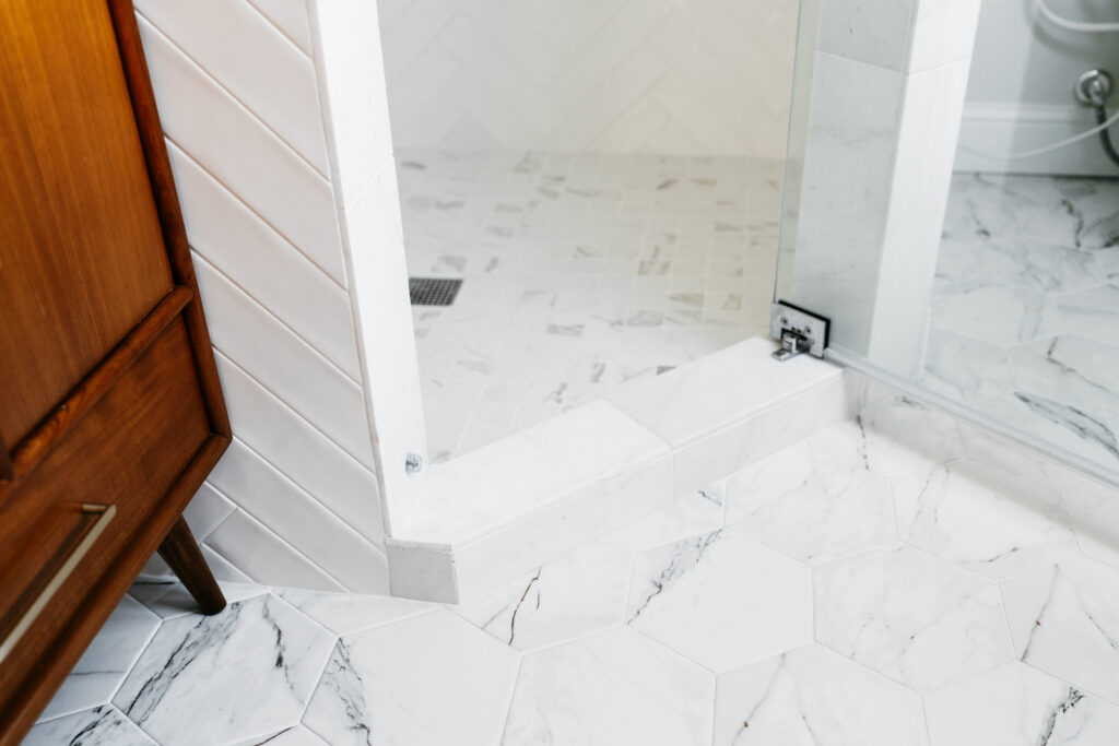
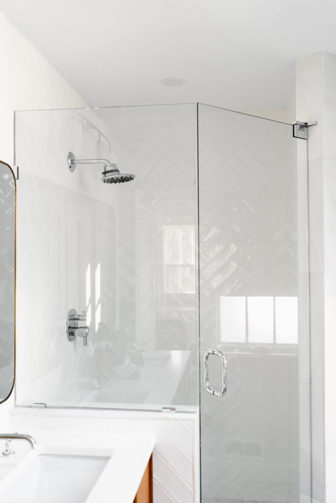
In order to achieve a consistent appearance in the bathroom, the herringbone pattern was extended from the shower walls to the vanity wall in a seamless manner. The white subway tiles used in the herringbone pattern provide the space with a clean and sophisticated look, while also adding a subtle touch of movement and personality. The design elements were carefully balanced to ensure that the bathroom maintained a sense of unity, while still offering an interesting visual appeal.
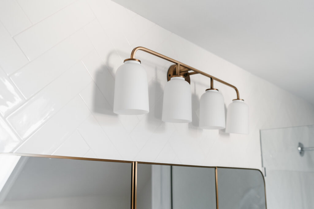
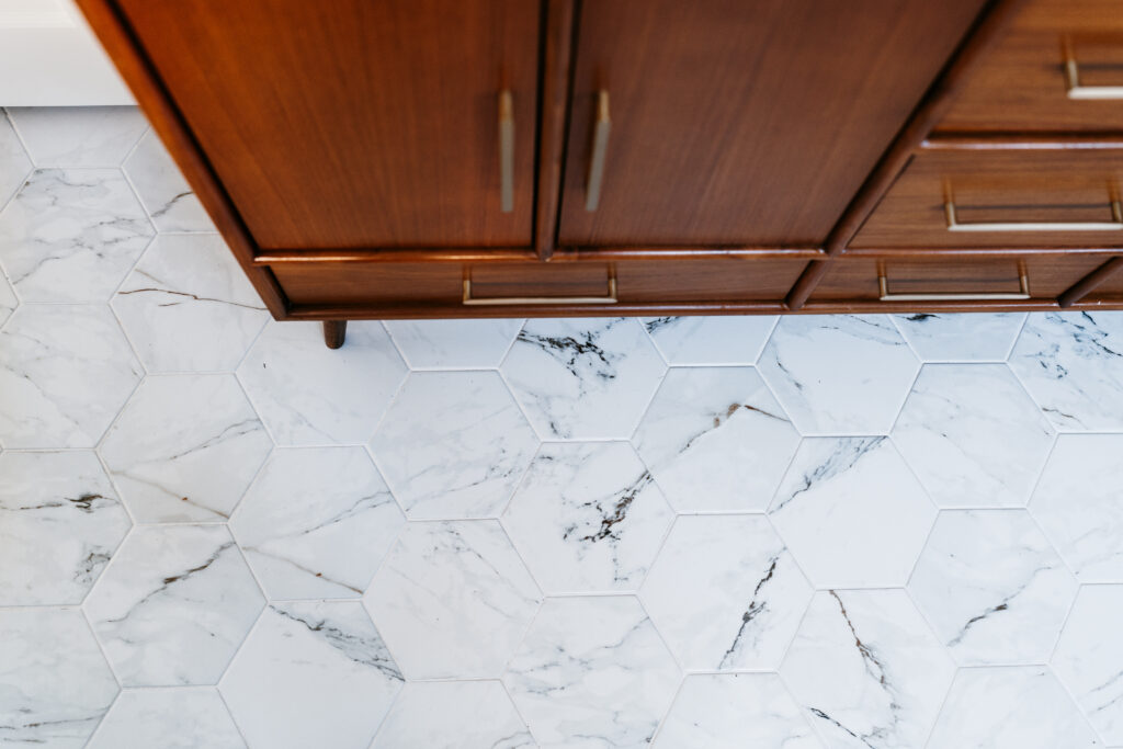
The herringbone pattern is a versatile design element that can interact with other tile designs to create a harmonious play on texture and shapes. The combination of the herringbone pattern with porcelain hexagon tiles on the floors is a strategic choice. This combination introduces movement and personality while seamlessly tying together different elements of the space.
The renovation of this primary bathroom in Edina is an excellent example of how thoughtful design choices can transform a space. They made every decision with care to create a personalized and functional bathroom that perfectly fits their needs.
If you’re feeling inspired by this remodel and are looking to embark on your own bathroom transformation journey, we’re here to help. At Moonstone, we turn your vision into reality by combining functionality with aesthetics to create a bathroom that reflects your unique personality and needs. Your dream bathroom is only a consultation away. Contact us today to explore how we can elevate your space!
Bring Home the Look | Shop The Selections
Free-Standing Tub | Tub Filler | Vanity | Vanity Faucet | Medicine Cabinet Mirror | Vanity Light Fixture | Shower Trim | Wall Tile | Floor Tile | Shower Floor Tile
see comments
close comments